INFOGRAPHIC: These 3 animated charts capture the rise of Asia
The economic rise of Asia has been swift, but it has also been a little reckless at times.
China's rapid spending and investment has come at a price. The country is now saddled with a massive debt bomb that could detonate at any moment. Further, economic interests have helped to create a precarious situation in the South China Sea, which many experts see as having escalating potential for armed conflict. Such actions would disrupt trade along one of the most important sea routes in the world.
To be fair, no one ever said that executing on five-year plans would be easy.
THE ECONOMIC RISE OF ASIA
Despite the possible economic landmines that could be waiting for China, it is still impressive how fast this all happened.
China now has the second-largest economy by a wide margin, but before the 1990s the country did not even crack the top 10.
The following three animated charts from data visualization whiz-kid Aron Strandberg help to tell the story of the rise of China - and how India is projected to follow in those same footsteps.

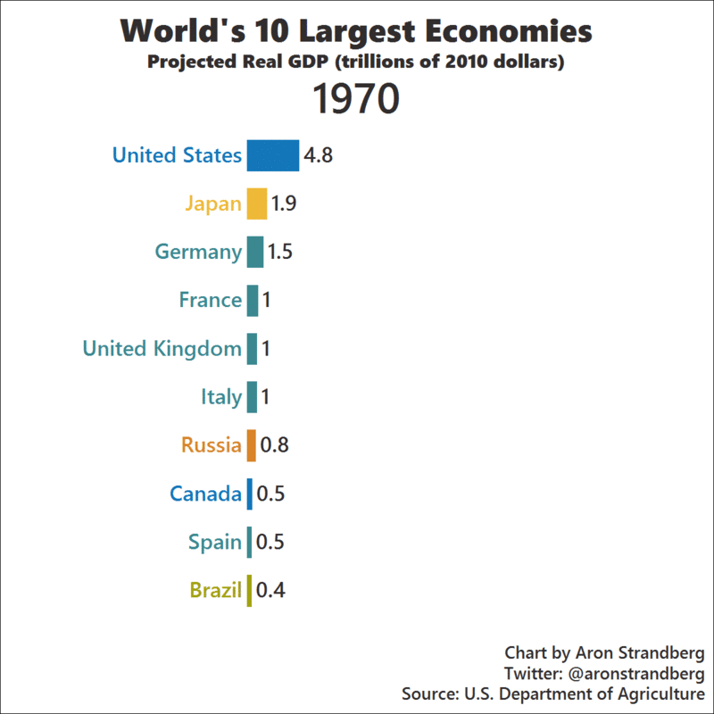
By the year 2030, it is projected that China and India will both be in the top three economies by real GDP. Even with growth continuing to stagnate, Japan remains in fourth place.
European economies such as France, Italy, and Spain also begin to slow in their pace of growth as the European Debt Crisis, demographics, and other factors start to weigh on them in the late 2000s.
Here's another look at the top 10, this time with a focus on the share of the global economy that each country will have. This chart really shows the effects of this aforementioned stagnation in Japan, as well as the slowing growth in Europe.

Japan's share of the world economy drops like a rock - and the same goes for countries like Italy and France, which also fall down the list.
By 2030, the United States, China, and India now make up almost 43% of the global economy.
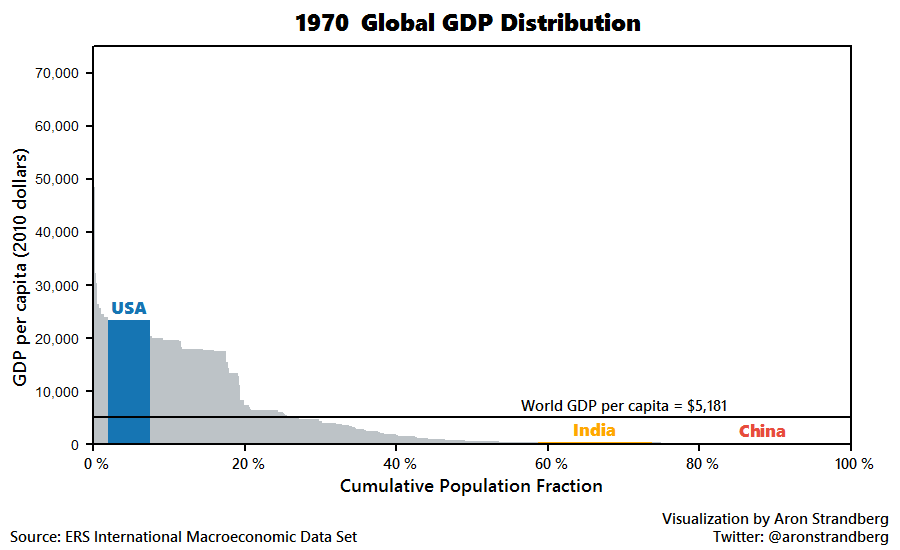
Lastly, we show GDP per capita charted against population share:
By Jeff Desjardins